Project 2 - Don't Sleep on the Subway
About the app
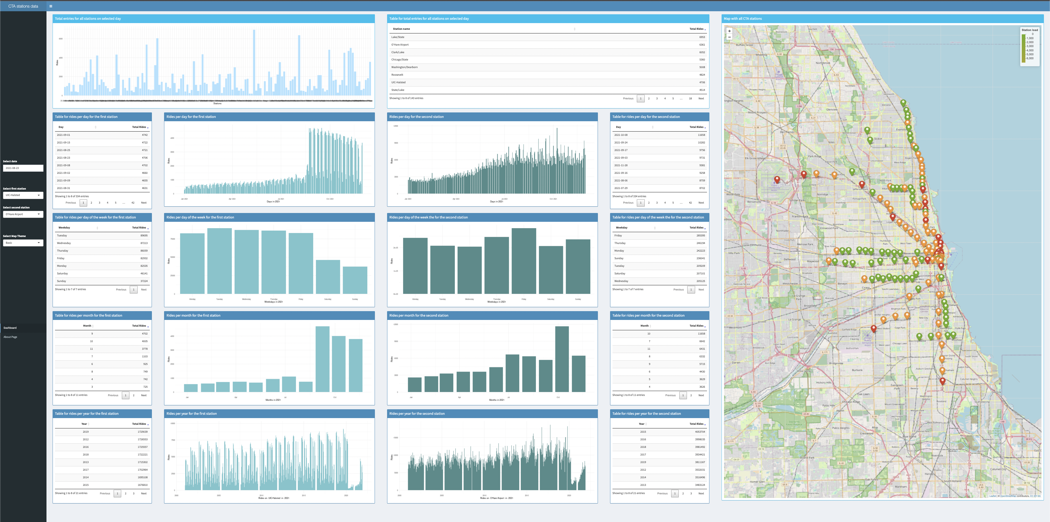
The application was created to visualize the data about all Chicago Stations on both the Bar Charts and Interactive Map. Data depicts the number of rides that was taken on those stations from 2001 to 2021 (November) as well as their coordinates. You can see that the dashboard is divided into four columns and each column and each pair of two represent first and selcond selected station accordingly and a huge interactive map on the right side. First row shows the total entries for all stations on a selected day in bar chart form as well as in table form. The next row is about rides per day for the first station as well as the second one and you can see the data being shown in a bar charts and tables. After that, the following row contains information about rides per day of the week for the both stations. Then, the next row shows info about rides per month for both stations. Finally the last row is for displaying total rides per each year for both stations. The menu on the right consists of two tabs and four main input fields that you can interact with. There are 2 tabs which navigate to Dashboard and About Page. Through the four input fields in the menu you can choose the specific date, 2 particular stations and a map scheme which will update the interface accordingly and show the relevant information. Selection of one station does not change the info that is being displayed for the other one and vice versa, so that they do not overlap in terms of UI and to be clear what is shown for which station. On the about page, where you can navigate by clicking About Page tab, you will find why we created this application and where the data was taken from.
See the dashboard Link to GitHub source codeProject overview
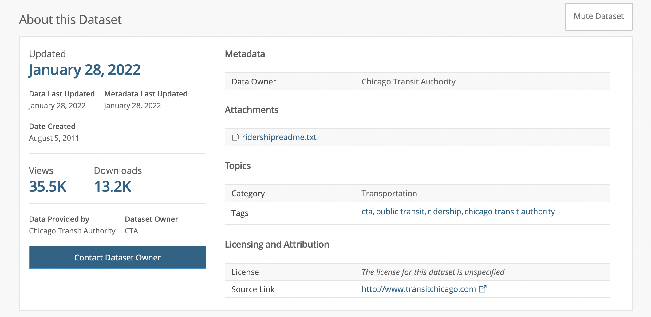
Where the data was taken from?
The dataset was taken from the official Chicago Data Portal website which has data about all stations in Chicago area. This list shows daily totals of ridership, by station entry, for each 'L' station dating back to 2001. Dataset shows entries at all turnstiles, combined, for each station. Ridership statistics are provided on a system-wide and bus route/station-level basis. Ridership is primarily counted as boarding, that is, customers boarding a transit vehicle (bus or rail). On the rail system, there is a distinction between station entries and total rides, or boarding. Datasets indicate such in their file name and description. In order to analyze the data in R, We read the file and took only the stations we needed. However, when we saw that roughly 77 stations locations were missing, we found them all out and put it into our separate tsv file and parsed it thereafter to get the full data so that we don't have holes in our dataset when finished. Afterwards, we parsed the data and did some manipulations to it so that we got the following things: Date separated into columns, names of weekdays and months, combined coordinates of all stations and separated into long and lat columns. We used functions such as: aggregate, left_join, paste, pull, sub, substr and etc. That was done in order to get the needed pieces of data and compose one huge table that contained all the relevant data in correct format. All graphs were rendered by using ggplot2 lib.
Link to the main dataset Link to the coordinates dataset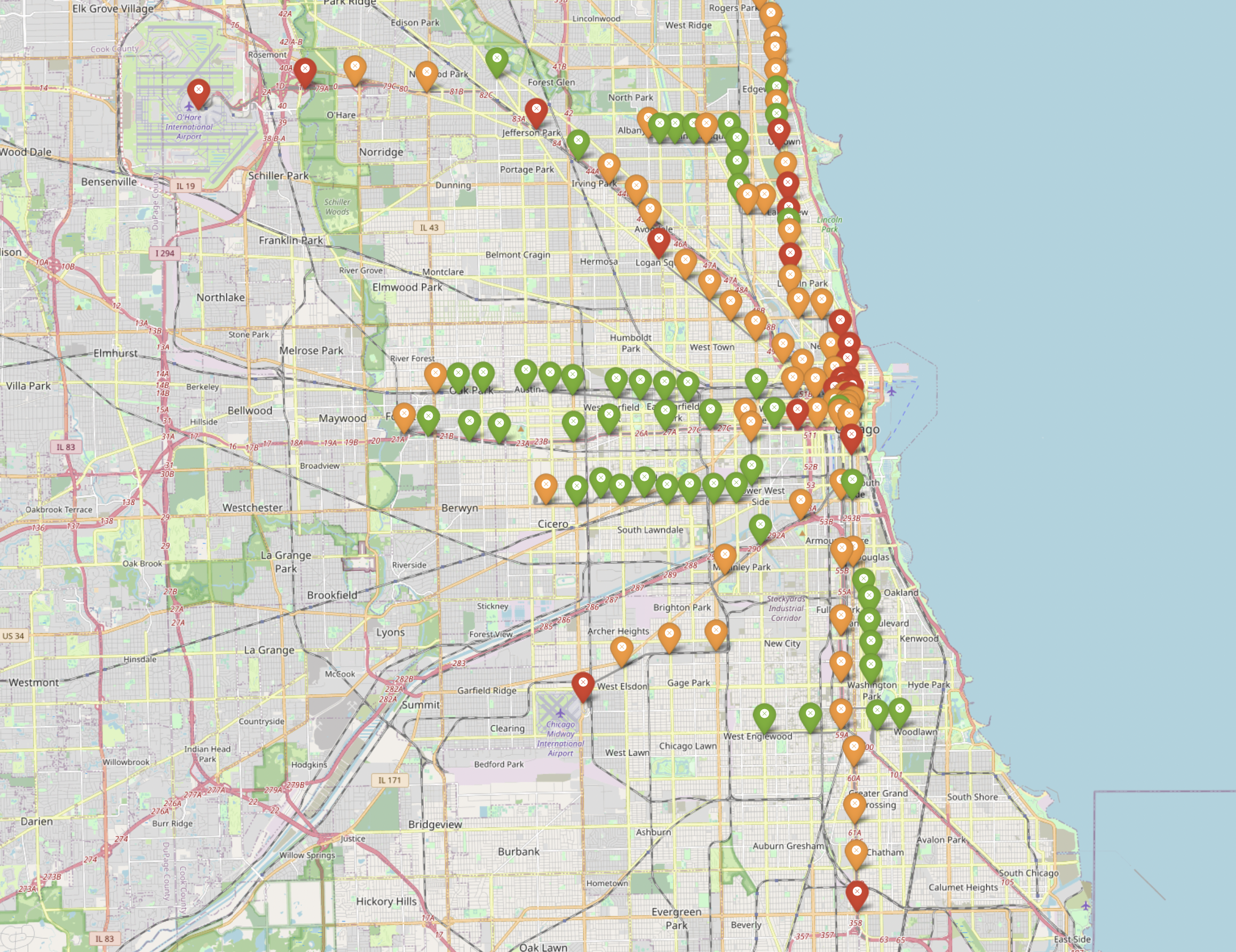
Interesting trends
1. First of all, if you take a look at the map which shows all available stations in the dataset with color that represents the total number of rides, we can clearly see that the majority of heavy loaded stations which are marked with red color are in the following places: downtown, region upper downtown and the last stations. Specifically, in south-west, south and north-west parts of Chicago (Midway Airport, O'Hare Airport, 95th/Dan Ryan). By observing these stations we see that almost on each day they stay the most loaded stations. That is due to the fact that the most number of people would like to travel from these places. For example, it is obvious that in downtown huge amount of people take rides because it is the center of the city, but what about the outskirts? Why outskirts last stations are red? We think that is because people that come from rural parts of chicago that do not have direct close access to CTA station but only to that last station would take either a car or a bus to that particular station. We can also see that the stations are positioned in a way that results in giving an even level of access from any place in the city, but those people from those regions that positioned far from ending stations can take a ride only on them, so that's the reason for those ending stations to have a high load 2. Another interesting thing we saw is that if we take a look at the map and compare number of high volumed stations in 2021 and in 2010, they show that stations were used more often in 2021 than in 2010. We think that is the case because overall CTA system was optimised in a way that the higher number of people became more distributed between bus and train stations as more and more stations were created and larger number of buses and new routes were becoming available with each year.
Some code parts from the project
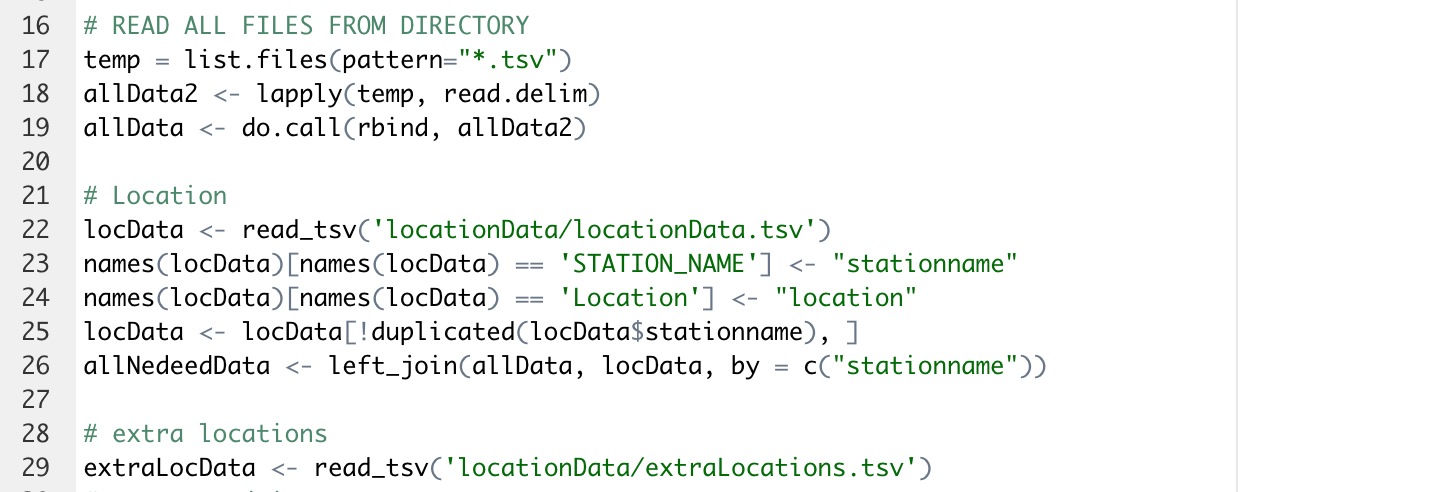
Read all data
Here we read all needed data from two sets: main and additional one that we created ourselves for missing stations data.
Coordinates parsing
Here we do series of transformations in order to get coordinates parsed and separated into two different numeric value columns.
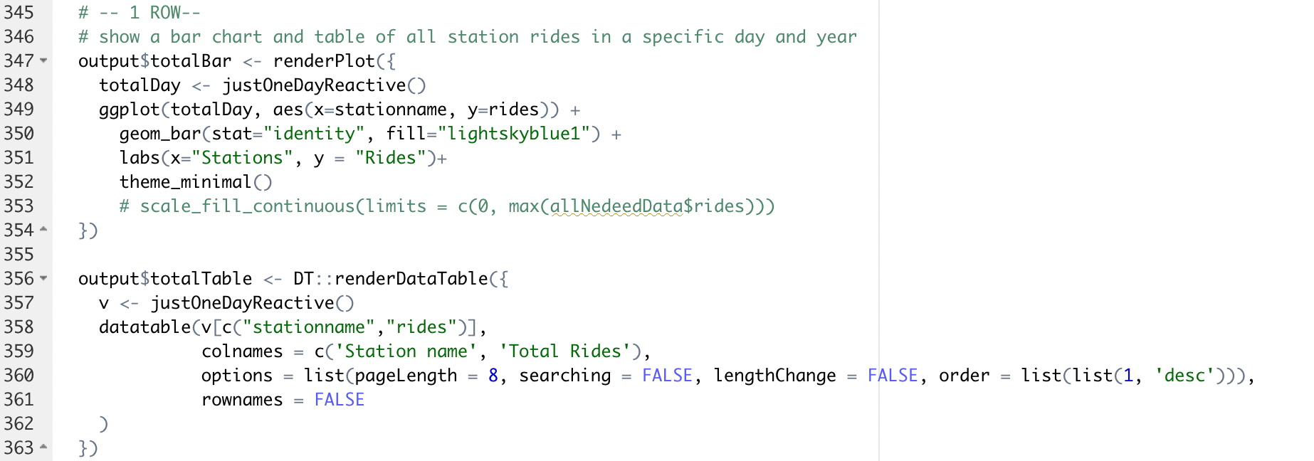
Rendering code
Here we use ggplot2 functions in order to display our bar chart and table in the first row correctly in the app.
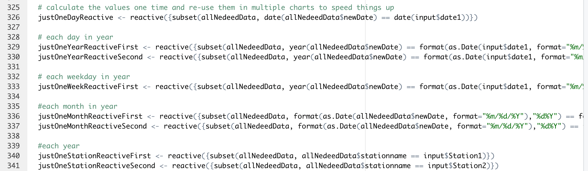
Reactive statements
Here we desclared all our reactive functions that took care of getting the updated input from user actions in the app.
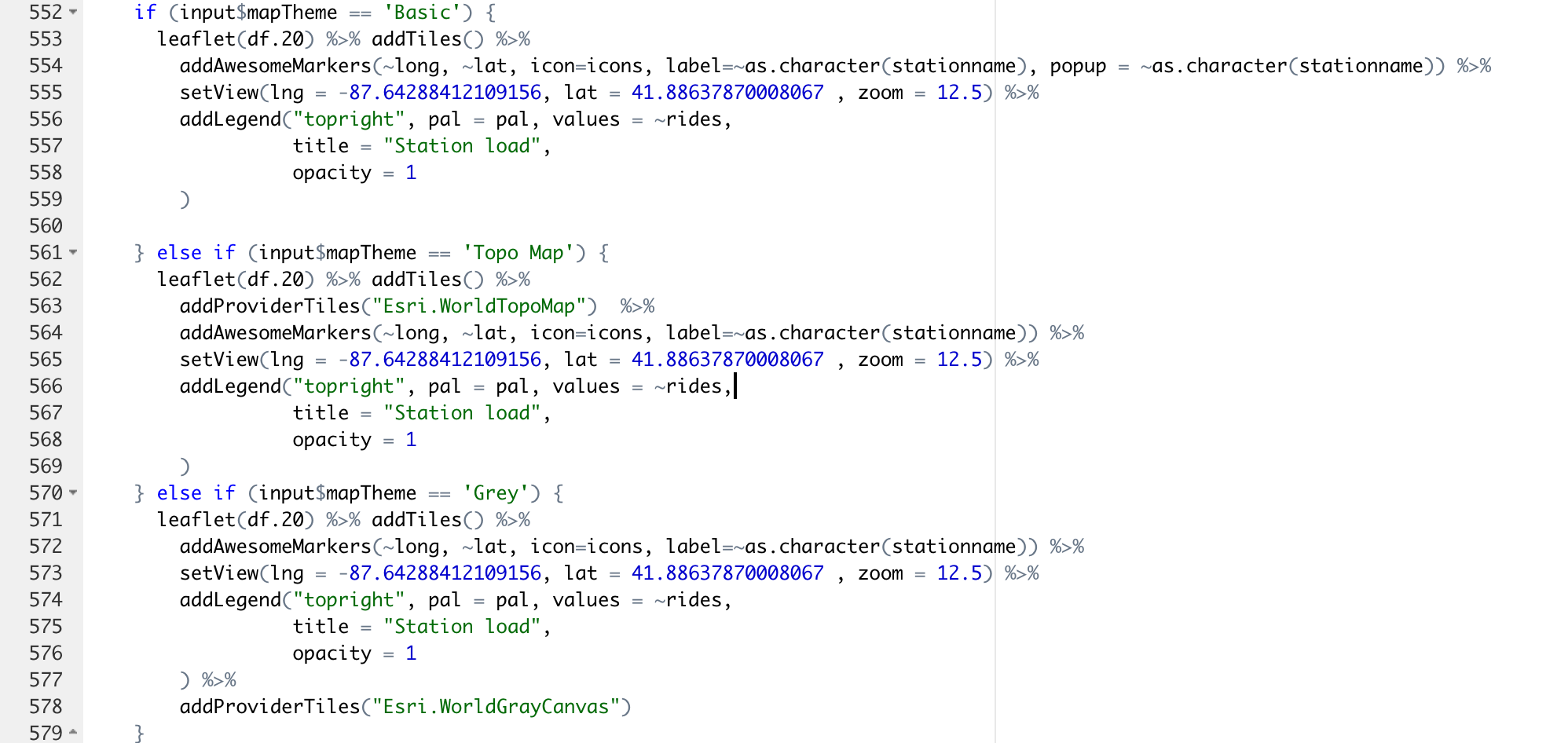
Map theme
Here is the code for the map theme handler that changes the theme to the one that the user chooses in the menu.