Student Choice
What is its purpose?
Some of the pages from Visualization
The purpose of this visualization website is to reveal the current and past states of Javascript in the tech field so that you either as a developer or a non programmer person who is just interested in it would make some conclusions about Javascript language.
What is the data?
Link to the visualization Javascript Findings 2021
The data is mainly about Javascript and people that use it which includes the following information: Demographics, Features, Libraries and their Opinions about Language overall.
How was the data collected?
By creating a huge survey and passing it to people around the world.
Who are the users that this visualization was made for?
This data will be really useful for anybody.
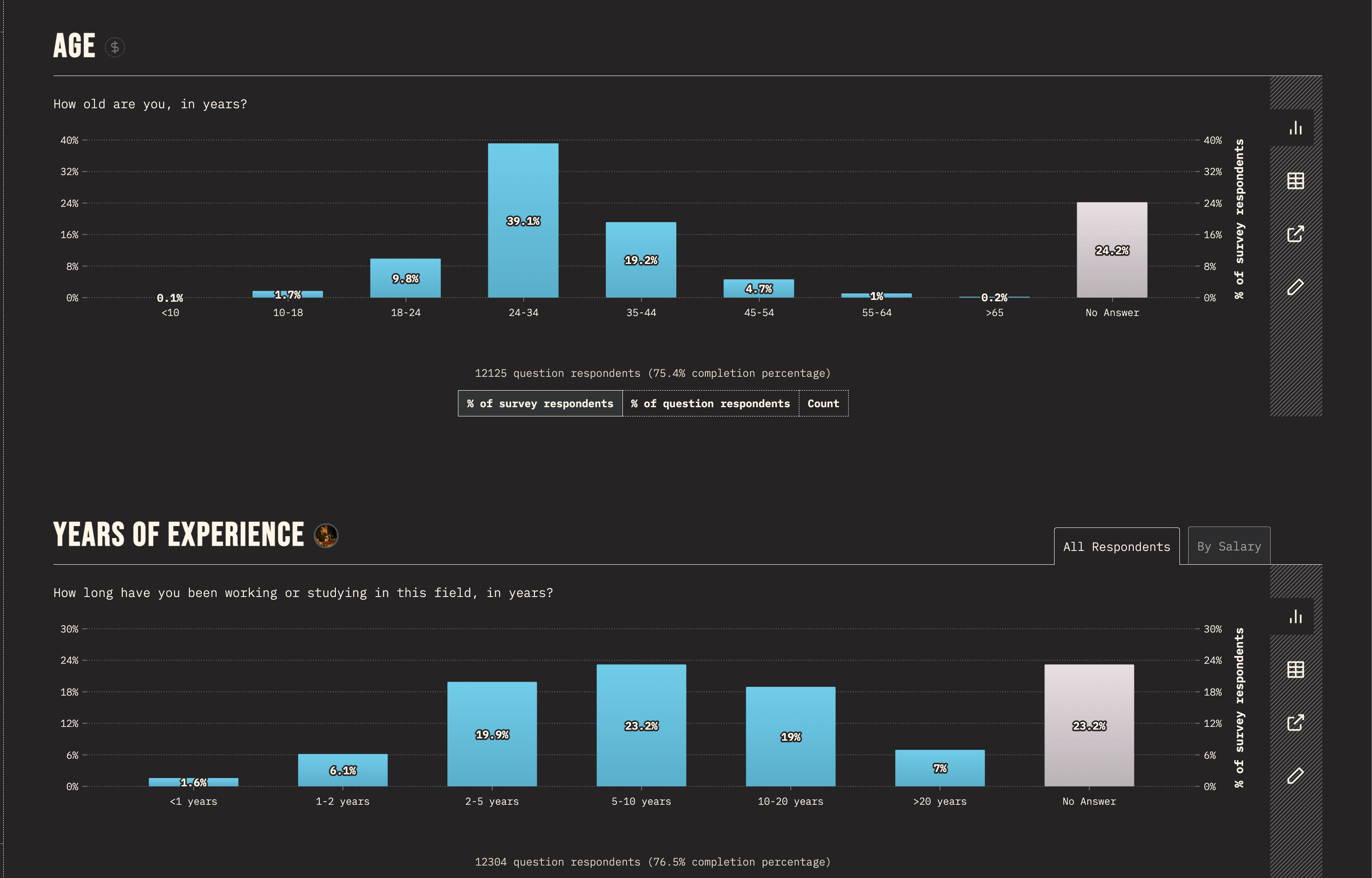
- If you are not familiar to this tech field, you would find some interesting facts such as what is the age of a regular programmer and what is the gender distribution.
- If you are a programmer and interested in Javascript language and its use cases, you will find information about what libraries are popular and mostly used.
- If you are a skilled developer who are using JS on regular basis, you would find interesting trends and changes to the tech overall and also other's opinion on this field.
What questions do people want to ask? How to find answers?
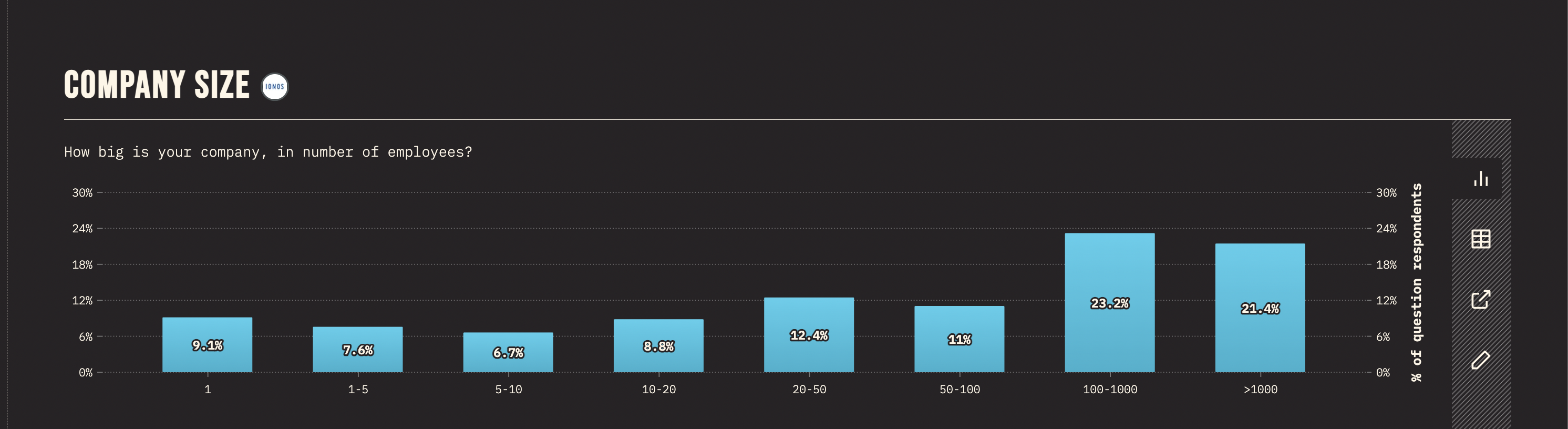
- Do majority of people work in a big companies? Or they prefer to work in small-medium ones?
- How many years of experience do majority of people have?
- Is the number of women grow with years or no?
-
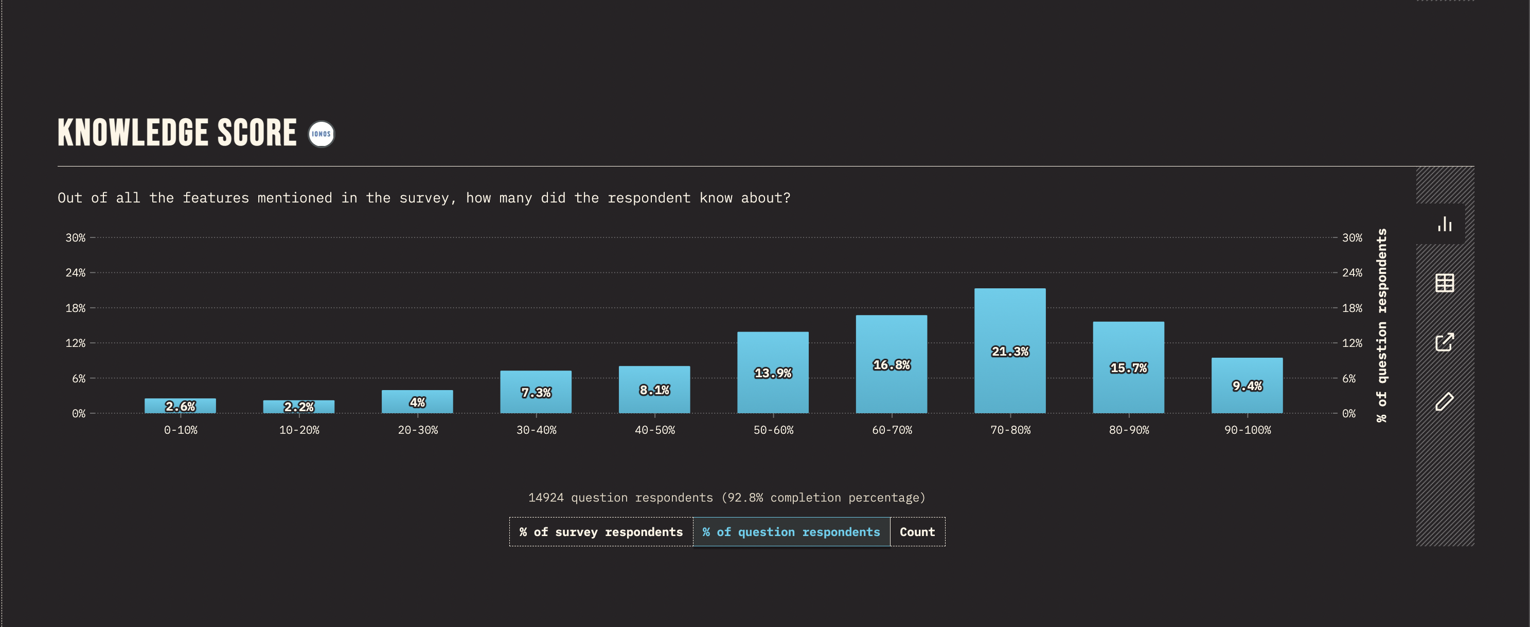
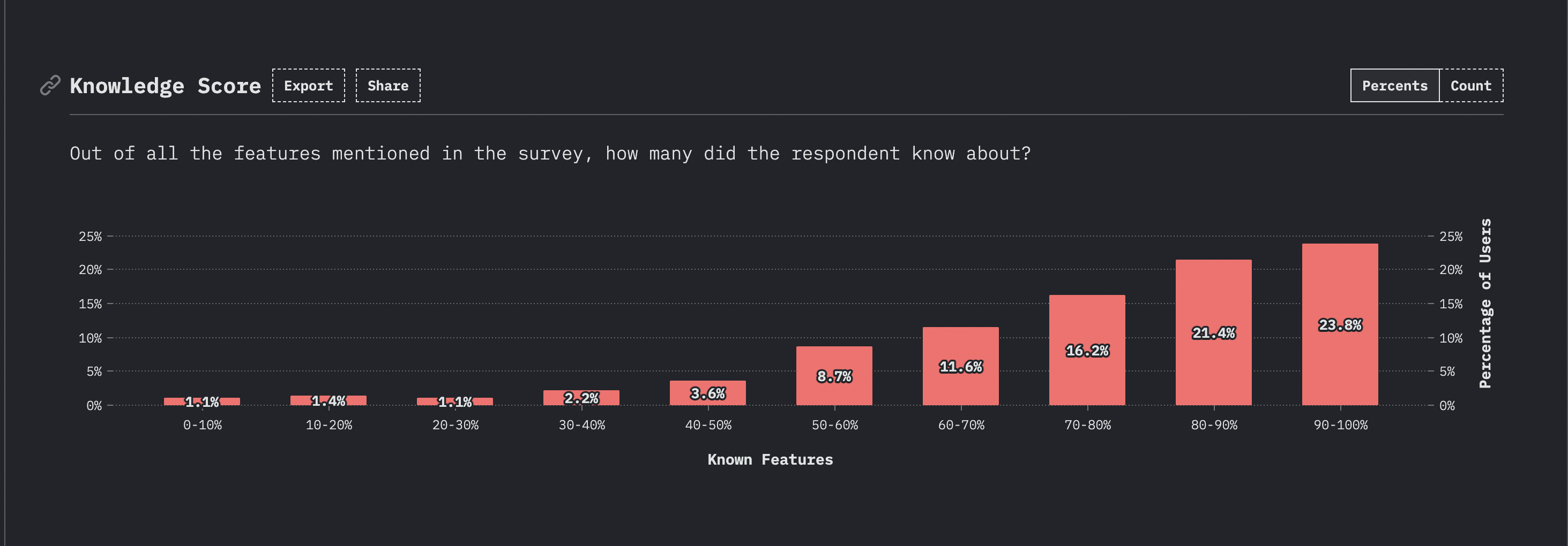
Do majority know every feature on the survey? Did they know all of it a year ago?
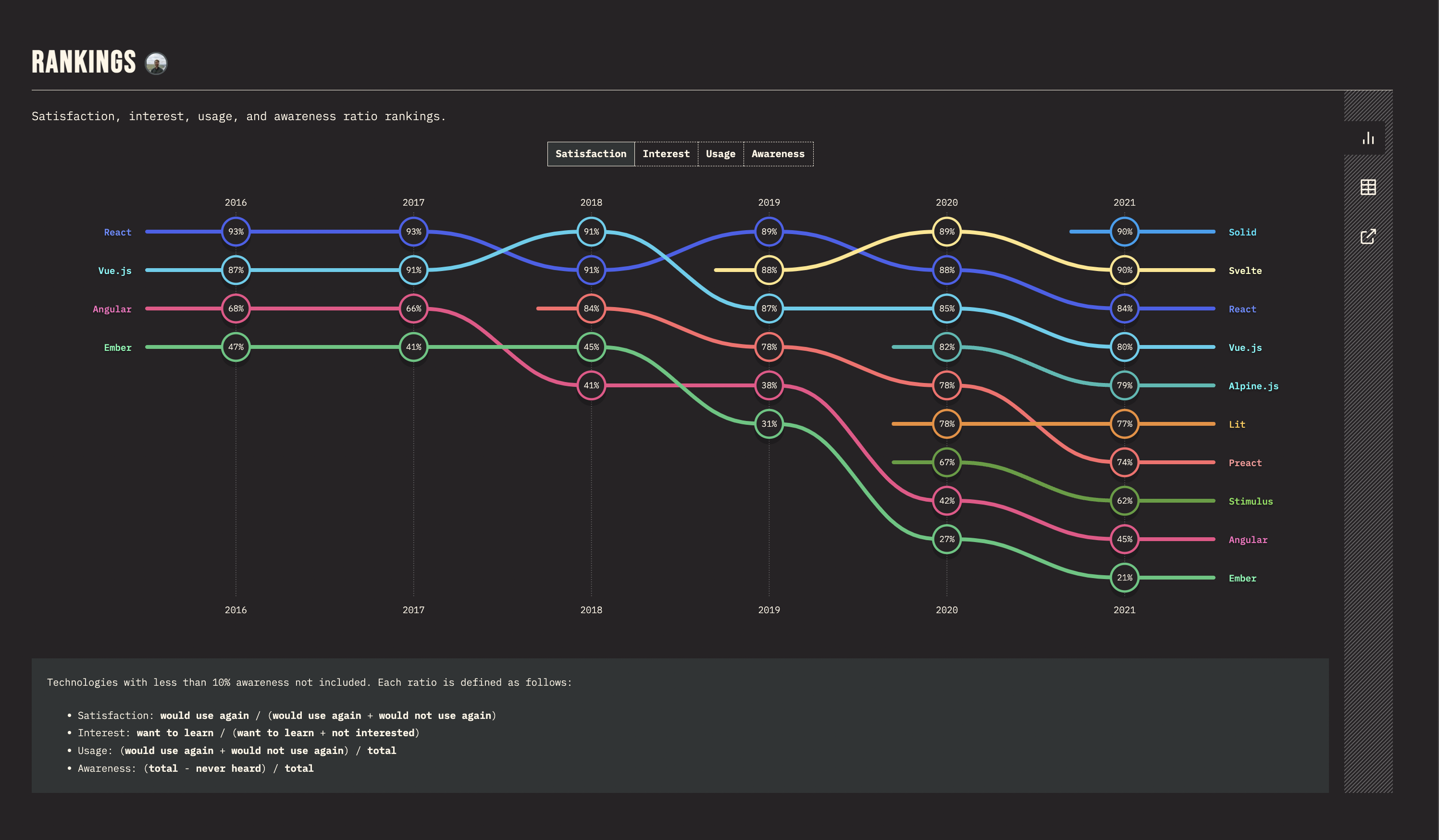
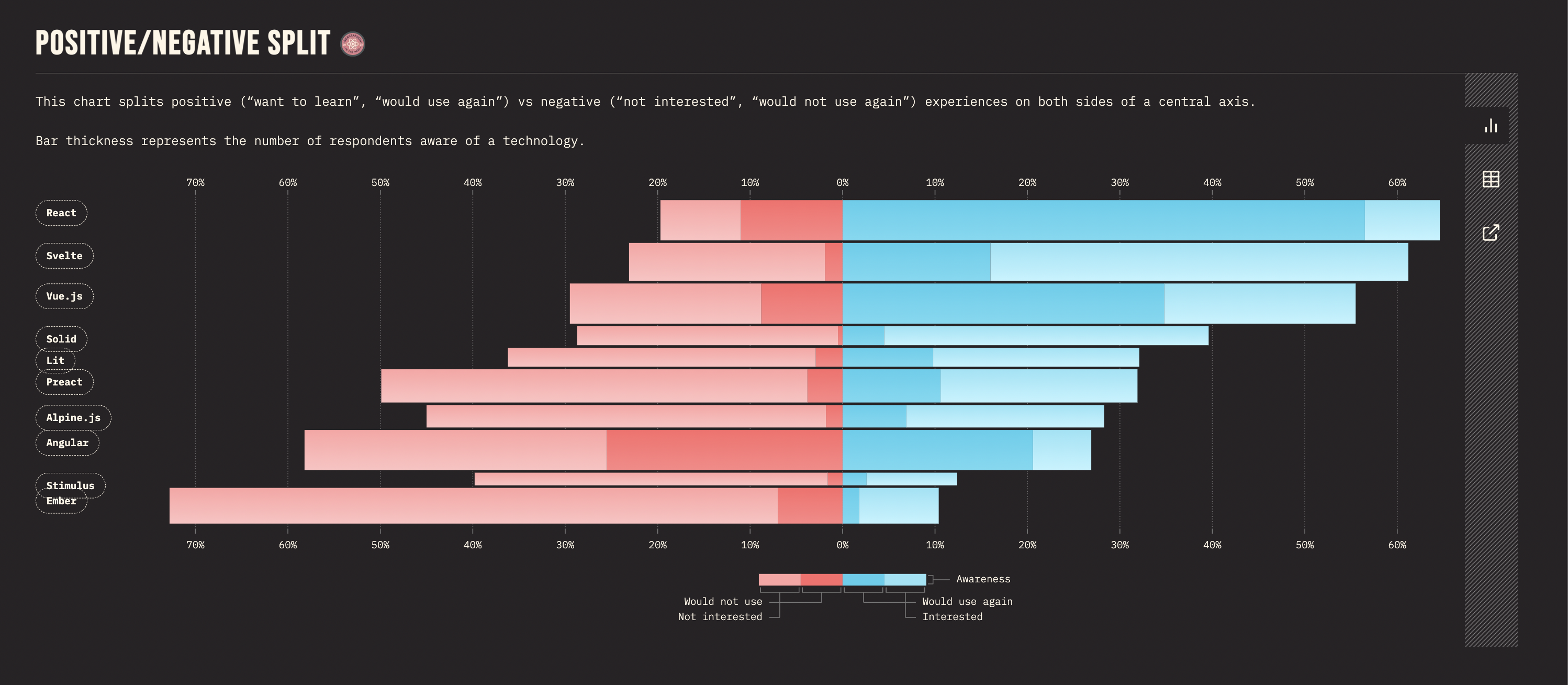
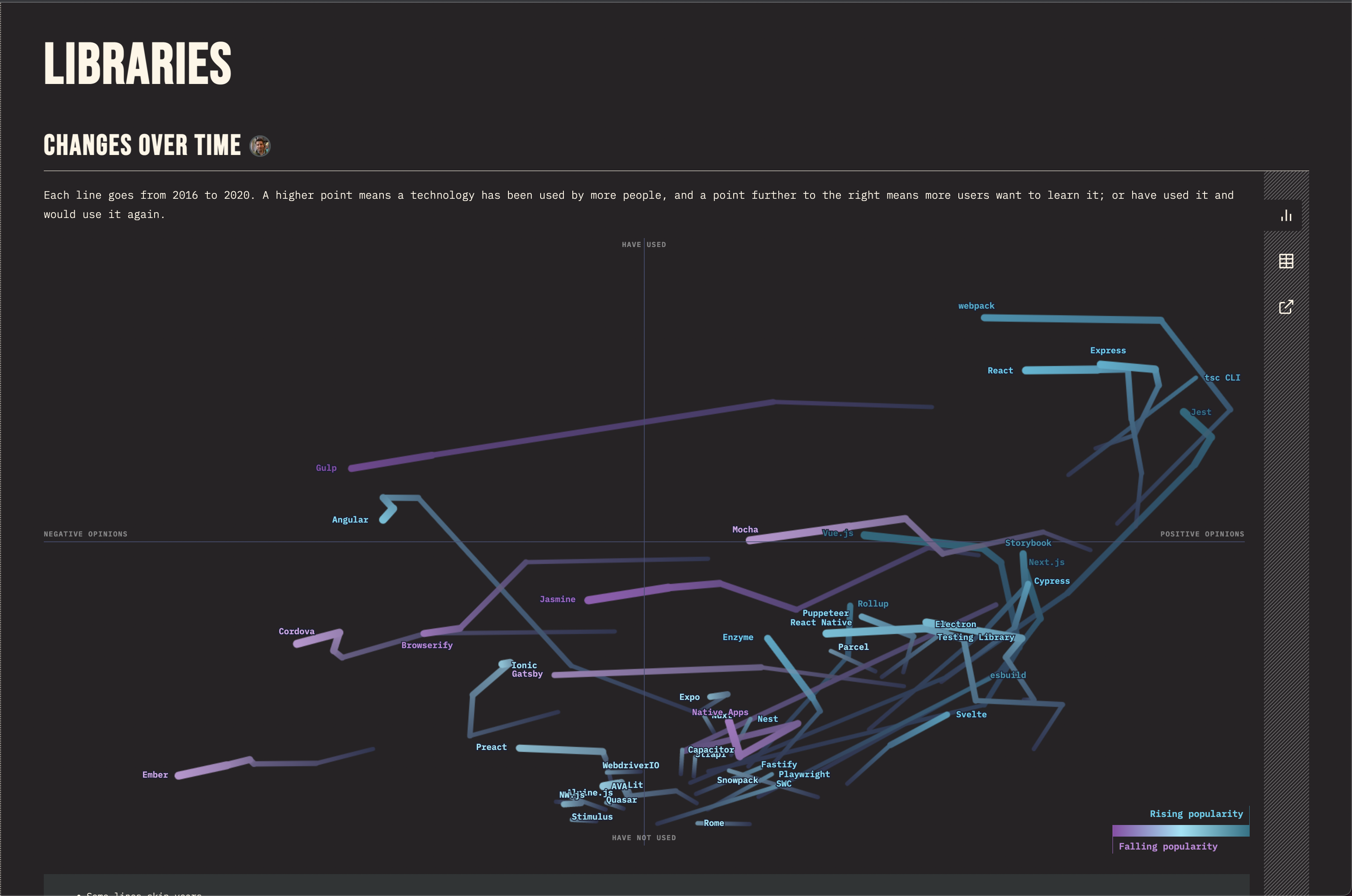
What's the trend of knowing every feature? Is it growing or decreasing? - Are there any new technologies in the field? What are they and how people like them overall?
- What about those technologies that were created in the past, are they still on the rise? Or they are not used? Is there any ability to see which one is going to thrive and which one is not?
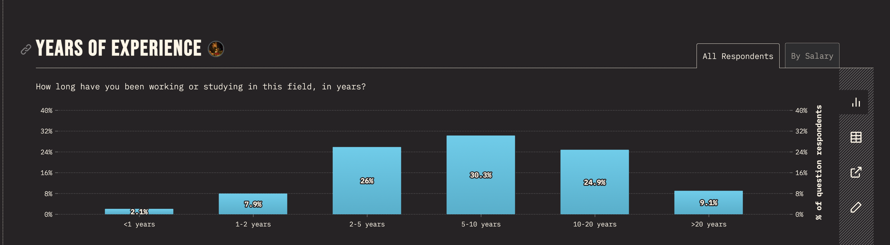
2021
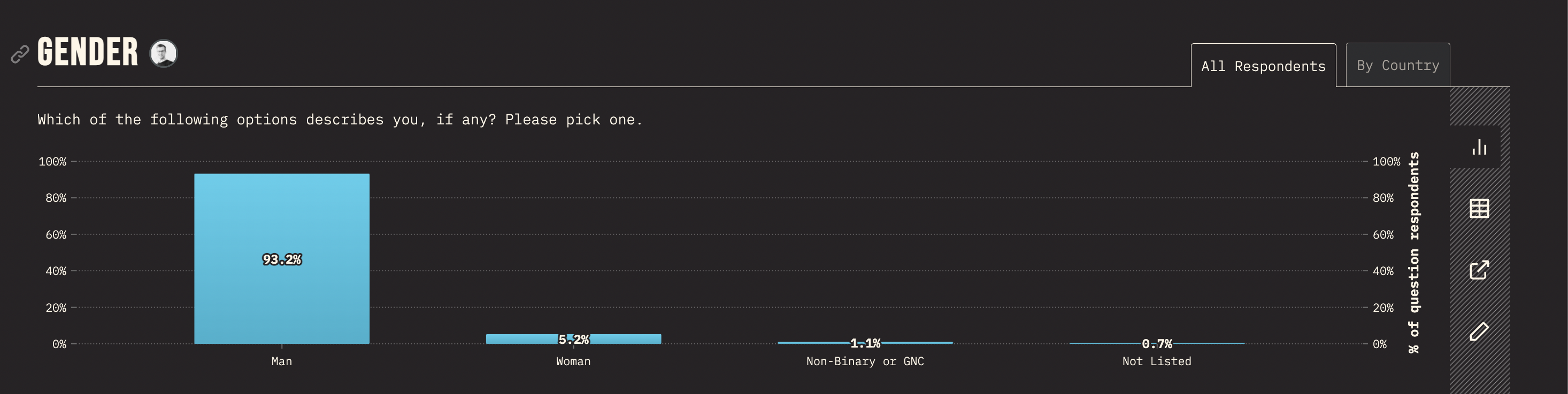
2020
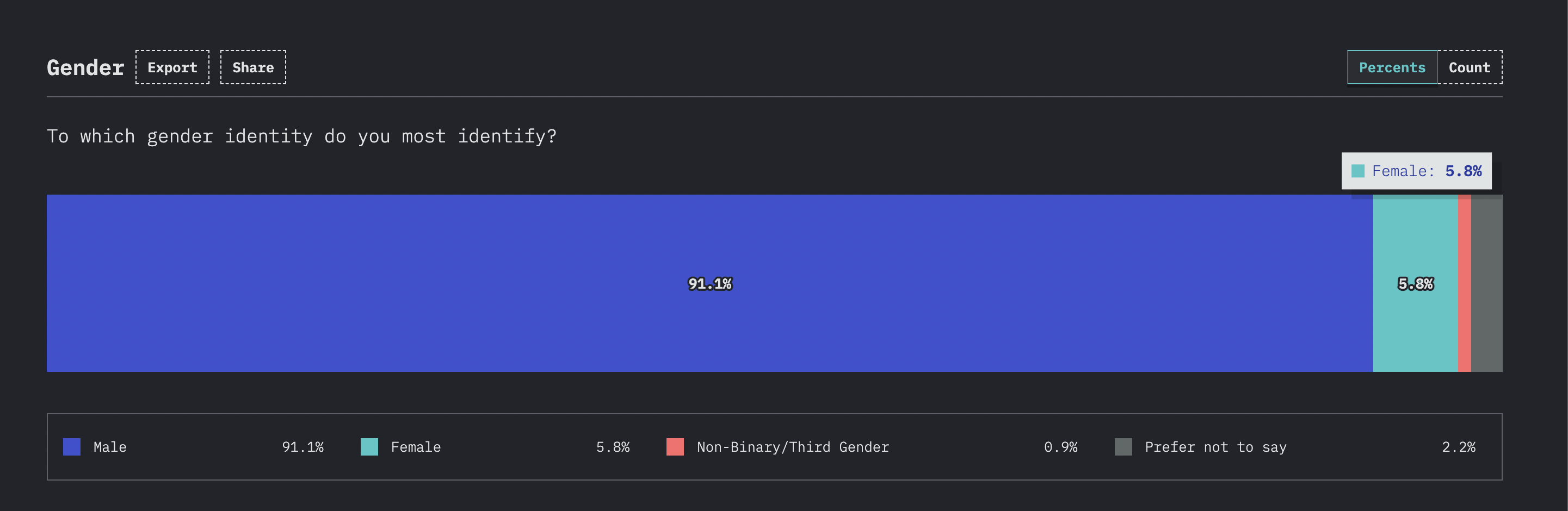
2021
2020
What works? What needs improvement?
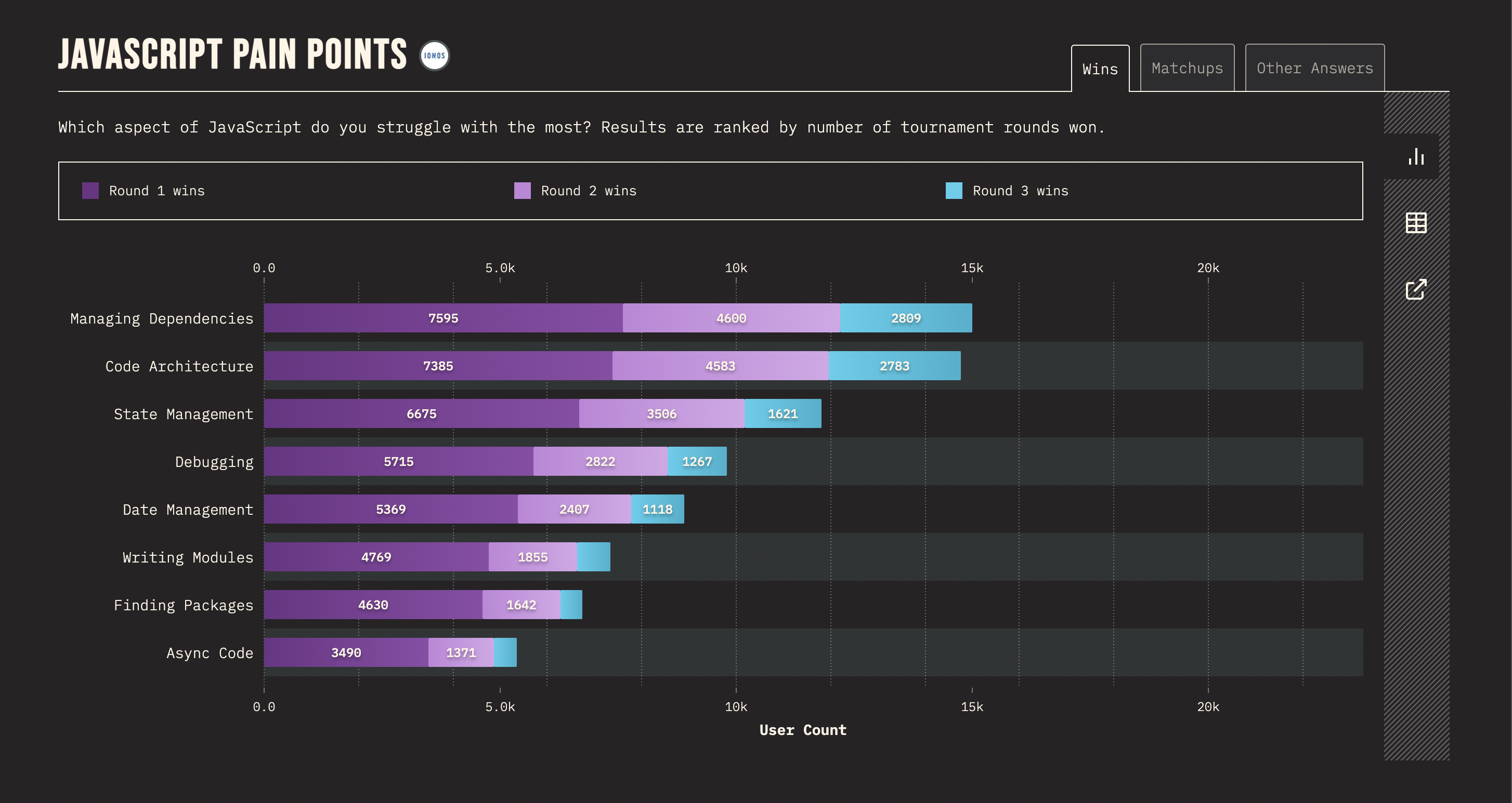
Excessive information on the unintuitive graph.
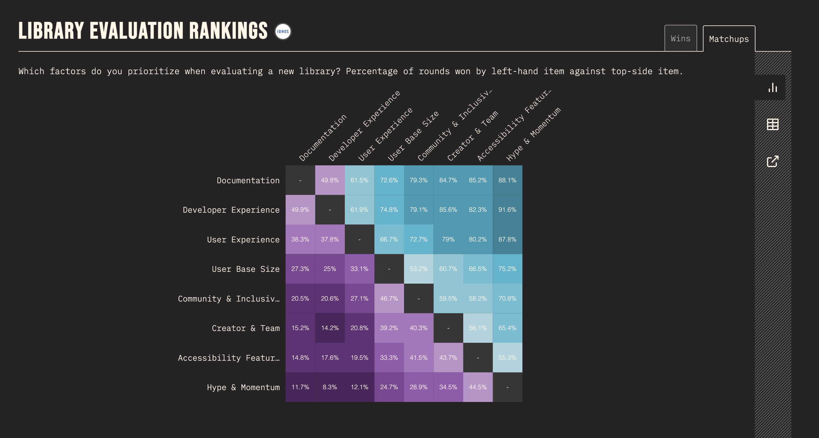
Unclear Rounds meaning and Confusing Coloring.